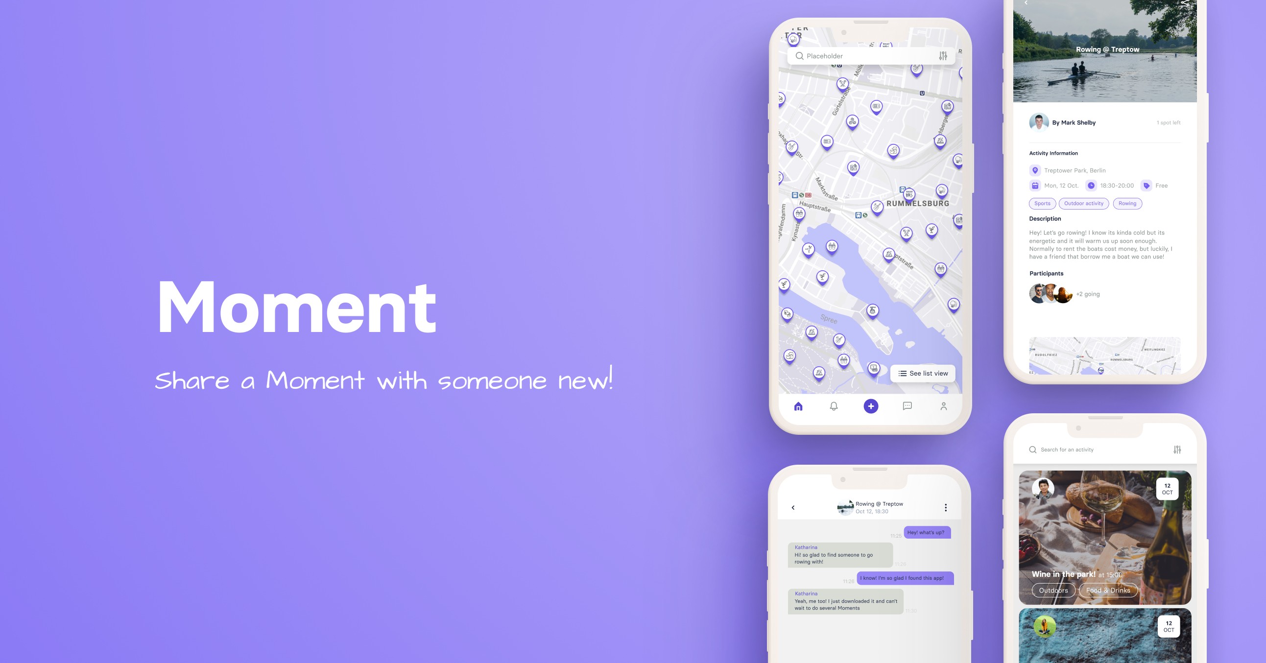
Travel App
Guidebook
Guidebook is app emerging that wants to make planning trips easier for travelers. During our sprint with Guidebook, we created initial user flows, branding and a design system to follow.
Reading time:
4 minutes

Role
Role
UX/UI Designer
Contributions
Contributions
Branding / Design System / UI
Timeline
Timeline
Feb 2022 - Mar 2022
Deliverable
Deliverable
Overview
Guidebook is a new and emerging app that wants to make planning trips easier for travelers. Accessible through both a mobile app and the browser, Guidebook combines recommendations from your circle of friends, expert information on major locations, and the planning tools you need to plan a great trip, all in one place.
Challenge
We were given a briefing of the company and what their needs were. Since Guidebook wasn’t yet developed, our challenge was as follows: How might we best present our user with the core functionalities (such as a map, list of locations, itinerary, and trip organization screen), and user flows?
We were given a briefing of the company and what their needs were. Since Guidebook wasn’t yet developed, our challenge was as follows: How might we best present our user with the core functionalities (such as a map, list of locations, itinerary, and trip organization screen), and user flows?
Project Goals
We had a deadline of two weeks to create this project. There was no previous designs, no branding, or design system. Base on this, we set clear goals, to be able to finish our tasks in these two weeks.
Create an MVP: we generated a simple user flow showing the main features and which ones were the most important for release
Branding & Design System: we wanted to built a design system that could be followed in the coming months.
Iterative Design: We wanted to test from the beginning, with lo-fi and hi-fi wireframes, and continue doing so with prototypes. This would ensure that the main user flows that we were building user-centric designs.


Design Process
Before we began, we interviewed the stakeholder to better understand their problems and needs. This also helped us to get to know the idea behind the product, business motivations, and purpose.
Research Stage
Surveys & Interviews: Guidebook had already conducted user surveys and some interviews, which gave us a lot of data to analyze. We conducted more interviews that helped us get to know better the target user.
Created User Persona: We created an empathy map that led us to our main user persona. Matt was created based on all the research made by Guidebook and our team. It combines the main demographics, pain points, wishes, and needs.
Competitive audit: We conducted an extensive competitive analysis to see where in the market the competitors were positioned and what features they were utilizing. This helped us understand the basic features each was using and what was missing. We also created a Competitive Landscape, and SWOT analysis. The Competitive landscape helped us better understand where Guidebook wanted to be positioned compared to its competitors.
Define Stage
Problem & hypothesis statement: Having the users we needed to design for in mind, we moved on to the define stage. Firstly, we redefined the problem and created our problem and hypothesis statement.
HMW: From this, we generated some HMW (how might we) statements, that would help us, later on, create the user flow.
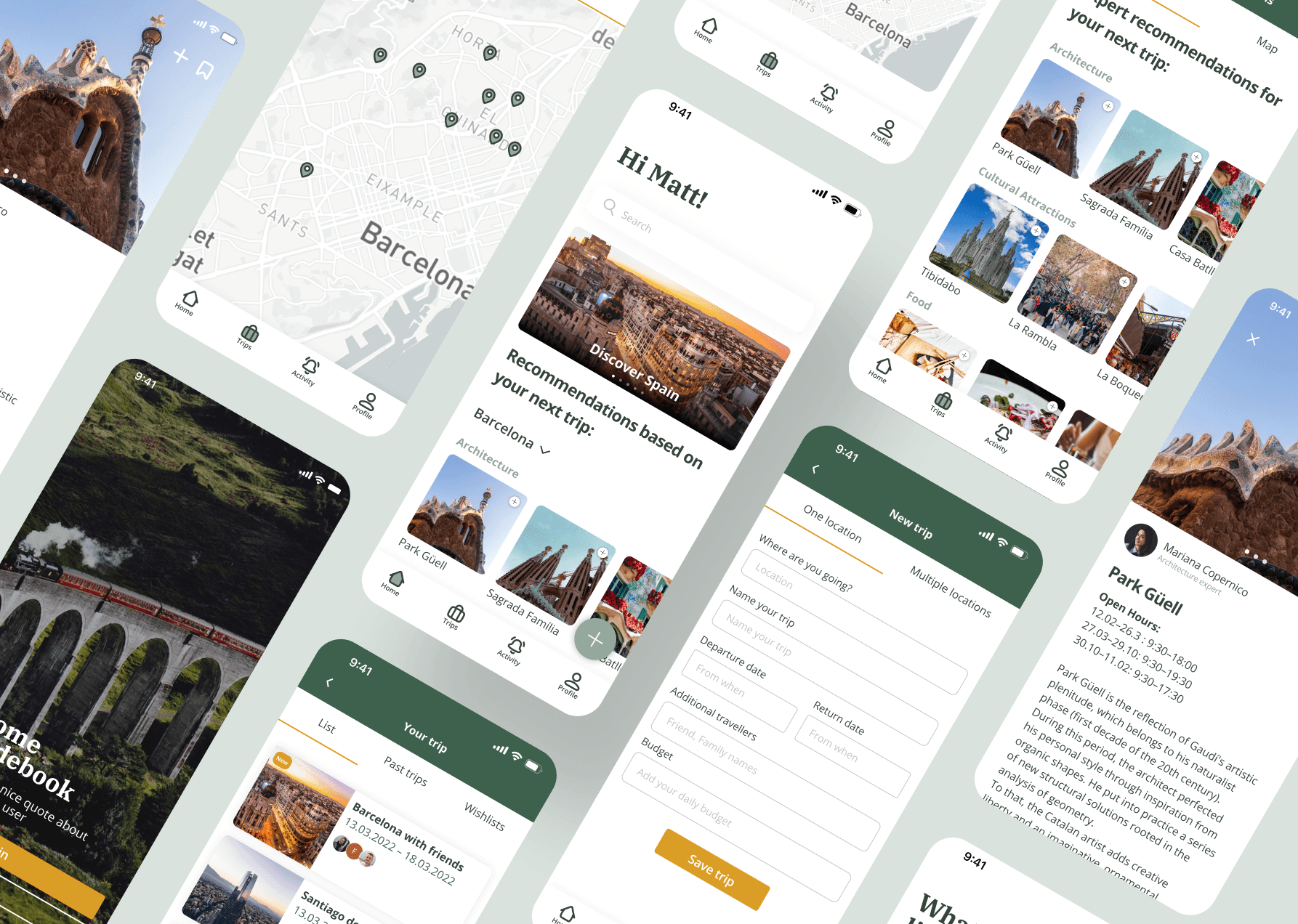
Hands-on paper: We created a user flow, which gave us a basic understanding of the steps the user needed to take to create a trip, the main feature we wanted to create. We also had different brainstorming sessions, created some crazy 8 sketches, and then low-fidelity wireframes
Prototype & Test
Mid-Fidelity Wireframe: When we finished our brainstorming sessions and sketching them out, we started creating mid-fidelity wireframes to test our user flow. We took a whole day to conduct user testing (AB testing, usability testing & desirability testing) and redesigned these wireframes according to our findings. This helped us a lot to improve the user flow and the information architecture that we had.
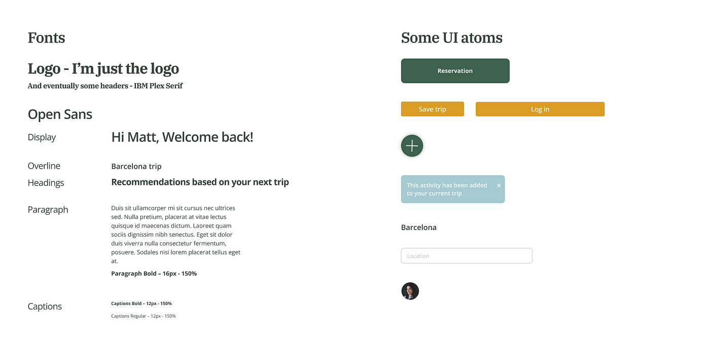
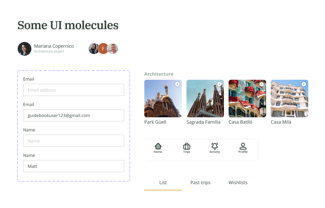
Branding and UI: Before starting the project, we didn’t have a design system or color palette. This meant that we needed to work on the brand, mood boards, and style tiles. The co-founders had already chosen the colour green but they were okay if we changed it. We created a Style Tile to visualize the font, colors, icons, and UI elements we would use for the prototype.
Before we began, we interviewed the stakeholder to better understand their problems and needs. This also helped us to get to know the idea behind the product, business motivations, and purpose.
Research Stage
Surveys & Interviews: Guidebook had already conducted user surveys and some interviews, which gave us a lot of data to analyze. We conducted more interviews that helped us get to know better the target user.
Created User Persona: We created an empathy map that led us to our main user persona. Matt was created based on all the research made by Guidebook and our team. It combines the main demographics, pain points, wishes, and needs.
Competitive audit: We conducted an extensive competitive analysis to see where in the market the competitors were positioned and what features they were utilizing. This helped us understand the basic features each was using and what was missing. We also created a Competitive Landscape, and SWOT analysis. The Competitive landscape helped us better understand where Guidebook wanted to be positioned compared to its competitors.
Define Stage
Problem & hypothesis statement: Having the users we needed to design for in mind, we moved on to the define stage. Firstly, we redefined the problem and created our problem and hypothesis statement.
HMW: From this, we generated some HMW (how might we) statements, that would help us, later on, create the user flow.
Hands-on paper: We created a user flow, which gave us a basic understanding of the steps the user needed to take to create a trip, the main feature we wanted to create. We also had different brainstorming sessions, created some crazy 8 sketches, and then low-fidelity wireframes
Prototype & Test
Mid-Fidelity Wireframe: When we finished our brainstorming sessions and sketching them out, we started creating mid-fidelity wireframes to test our user flow. We took a whole day to conduct user testing (AB testing, usability testing & desirability testing) and redesigned these wireframes according to our findings. This helped us a lot to improve the user flow and the information architecture that we had.
Branding and UI: Before starting the project, we didn’t have a design system or color palette. This meant that we needed to work on the brand, mood boards, and style tiles. The co-founders had already chosen the colour green but they were okay if we changed it. We created a Style Tile to visualize the font, colors, icons, and UI elements we would use for the prototype.
Design Goals
Based on our conversations with stakeholders and the user research we gathered, we identified our main design goals as follows:
Reusability: Create a product that users would want to reuse, even when they are not traveling.
Discoverability: Ensure users can easily find what they are seeking within the app.
Usability: Design the app to be straightforward and easy to use.
Design Tools
Figma: where all our designs lived, prototypes, mockups and presentation
FigJam: helped us built sitemaps, brainstorm, create user journey maps, etc.
Notion: is where we could add all the information collected while doing user research and keep the research done by the company previously.
Google Forms: we could create different forms here, to understand user preference to a bigger scale.


Design Solutions
Since we were building the app from the group up, we needed to set goals and the design approach we wanted to do.
Atomic Design: To be able to create the components, we decided to follow an atomic design approach. We started creating our design system in the 3 levels of the atomic design philosophy: atoms, molecules, and organisms. The fonts and UI elements were created, and out of them, we started creating molecules and organisms and when all this was built, we created pages out of the components and started connecting them.
Mobile First: The majority of the users plan part of their trips on their phones and during the trip they use mostly their phones. Since we had a tight deadline, we designed for mobile first to then bring it to desktop.
Results
During this two-week sprint, we manage to create not only a design system to follow and branding, but also the main user flows of the app. The main results that we had were:
Positive feedback from the stakeholders, deciding to bring the designs directly into production.
Our team won the best project of the class
Conclusion
After showing the whole process to the stakeholders and receiving some positive feedback, we would need to do another round of testing, to reiterate the design process and make sure the basic user flow of the app is as smooth as possible.
I envisioned to keep working alongside the co-founders and start creating other user flows, working with developers and product managers to take this app to the next level: production and later on to the app store.
Credits
Amy Little - UX/UI Designer
Javier Calvert - UX/UI Designer
Amy Little - UX/UI Designer
Javier Calvert - UX/UI Designer
See Other Projects

Barbara is now available for hire
Have a cool idea?
Let's make something cool together
Barbara is now available for hire
Have a cool idea?
Let's make something cool together
Barbara is now available for hire