Productivity App
OffBlock
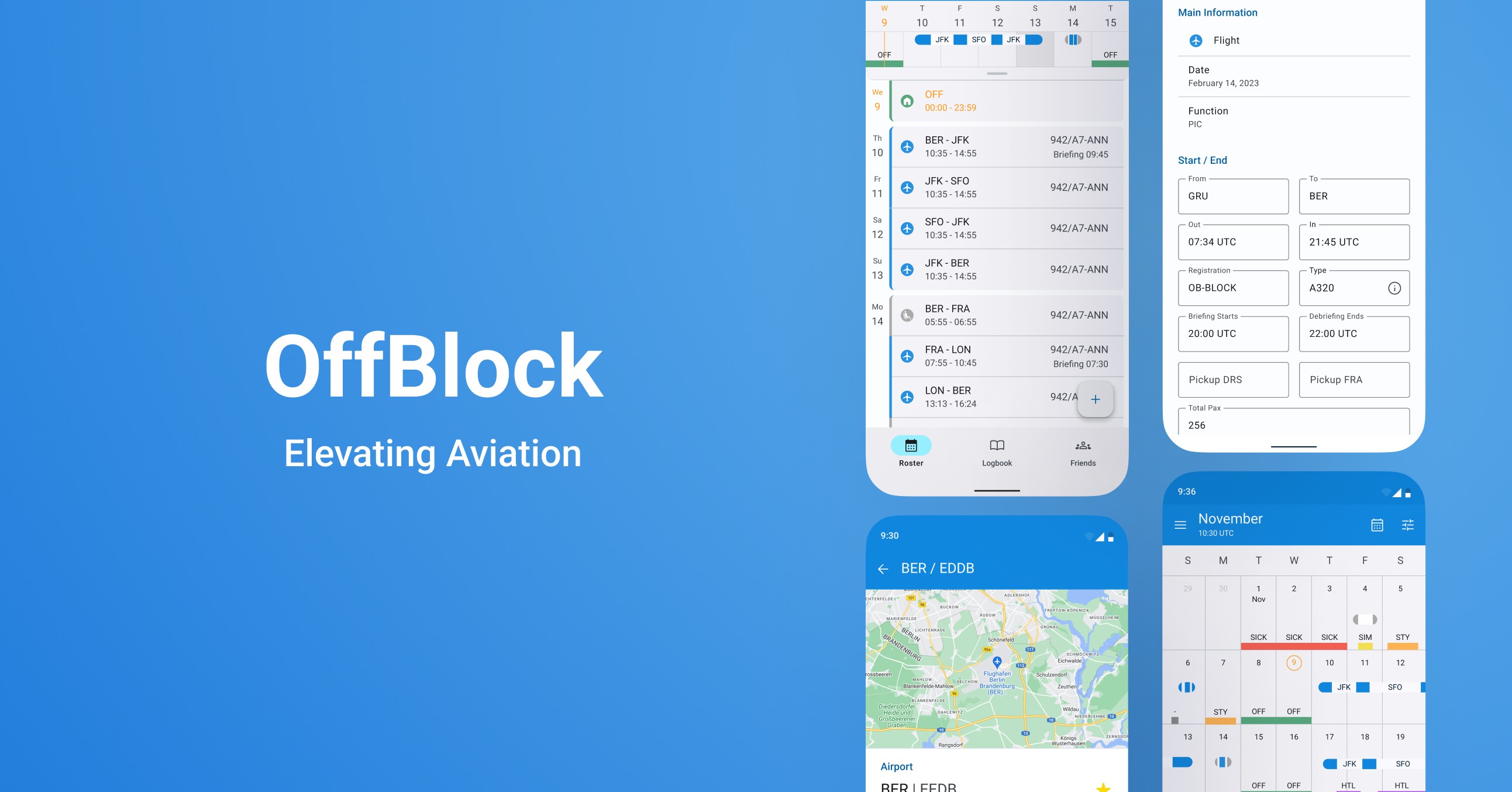
At OffBlock, I led the Android project, setting up a seamless transition from the pre-existing iOS app to the Android platform.
Reading time:
3 minutes


Role
Role
IU/UX Designer
Contributions
Contributions
UX/UI Design, Research, Social Media Ads
Timeline
Timeline
May 2022 - Mar 2024
Deliverable
Deliverable
App
Overview
OffBlock is a cloud-based mobile app displaying the daily routines of pilots and flight attendants worldwide. It features a comprehensive roster calendar for a simplified & modernized flight data management. Over the course of a two-year journey, I took charge of the app's Android design, enhancing user flows within an agile two-week sprint framework.
Challenge
Bringing the OffBlock app from iOS to Android posed unique challenges. We had to enhance multiple user flows, tailoring them to the Android environment, while also considering the limitations of the library employed by our developers (Jetpack Componse). Adapting the app required a meticulous balance between maintaining consistency with the iOS version and optimizing the user experience for Android users.
Bringing the OffBlock app from iOS to Android posed unique challenges. We had to enhance multiple user flows, tailoring them to the Android environment, while also considering the limitations of the library employed by our developers (Jetpack Componse). Adapting the app required a meticulous balance between maintaining consistency with the iOS version and optimizing the user experience for Android users.
Team & Goal
Collaborating closely with my iOS counterpart and the Android development team, I explored into understanding the existing user base. Our goal was to craft an Android experience that mirrored the established standards set by the iOS version, ensuring a cohesive and user-friendly transition. The team was form by:
1 Product Owner
1 Scrum Master
3 Android Developers
1 UI/UX designer (me)
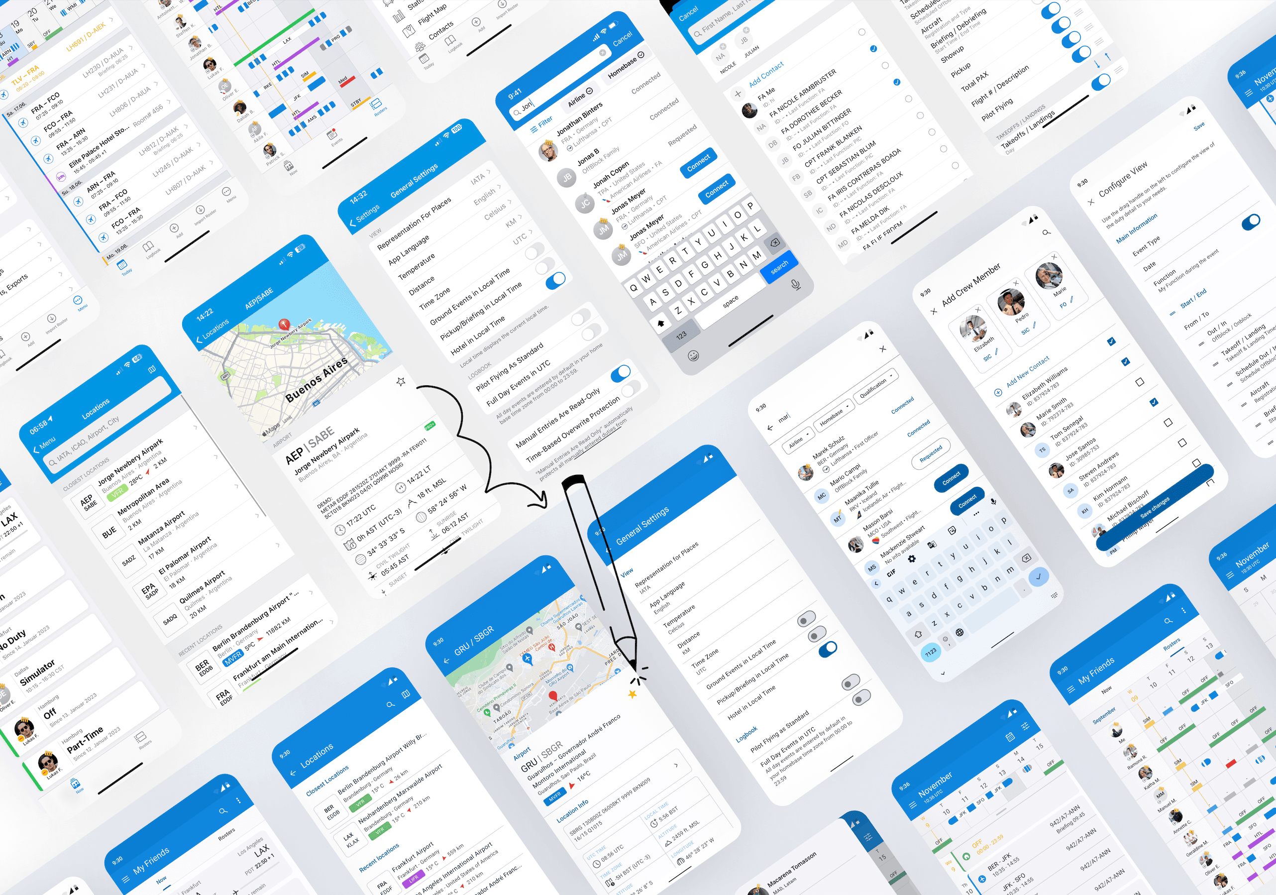


Figure 1: iOS screens to Android screens
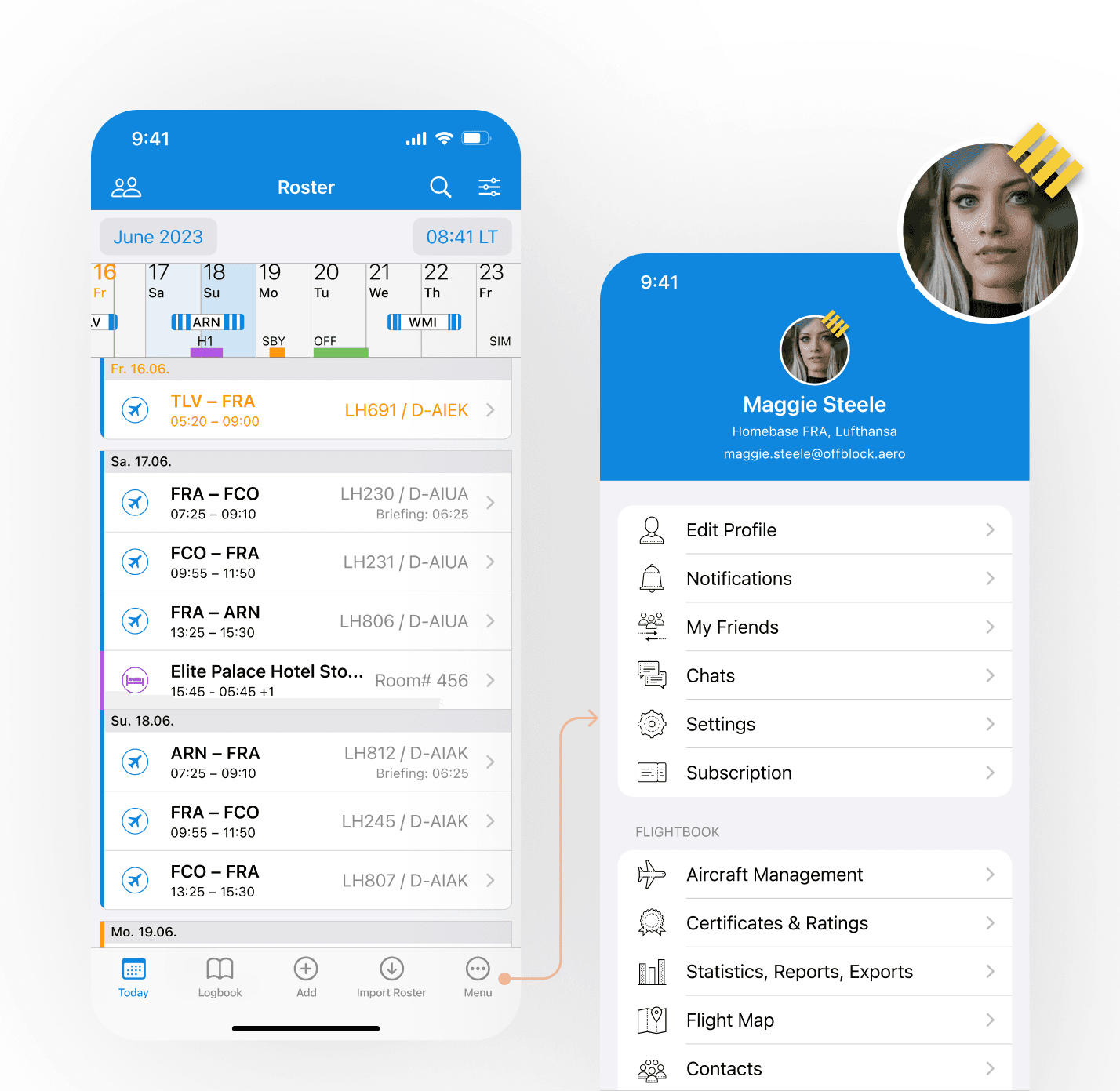


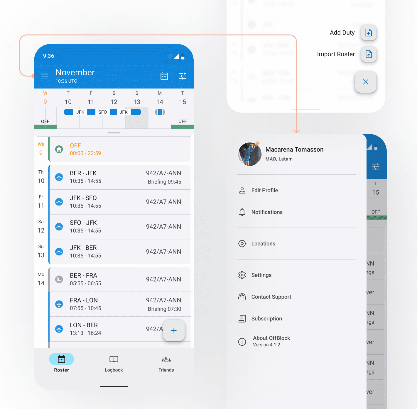


Figure 1: iOS screens to Android screens
Design Process
At OffBlock, we adapted the Scrum Methodology, with two-week sprints. After creating the architecture map of the app and an MVP that gave the users the main features of the app, we started creating feature by feature.
My workflow for designing new features was as follows:
Collaboration: I worked closely with the iOS designer to understand the feature deeply
Learn About the App: I would test the existing app to comprehend user flows and identify Android differentiators.
Hand in Hand: Collaborated constantly with developers to find optimal solutions compatible with the implemented library (Jetpack Compose).
Research: I analyzed our competitors and other existing android apps to better understand the best user flow for the Android users.
Concept and Design: I created wireframes, high fidelity prototypes and conducted testing to get feedback.
Usability Testing: it was important to conduct testing before and after each release to identify problems and redefine our concepts.
Design Goals
As the UI/UX Designer, my main responsibility was to synchronize the design guidelines between iOS and Android, guaranteeing consistency, while crafting an MVP that adhered to established branding but prioritized the unique needs of Android users.
Maintain visual consistency: Even when there were 2 apps, it was very important for us to maintain a consistency between the two apps.
Optimize user flows: with each new sprint, we analized the user flow we were working, and improved it while prioritizing a seamless experience tailored for Android users.
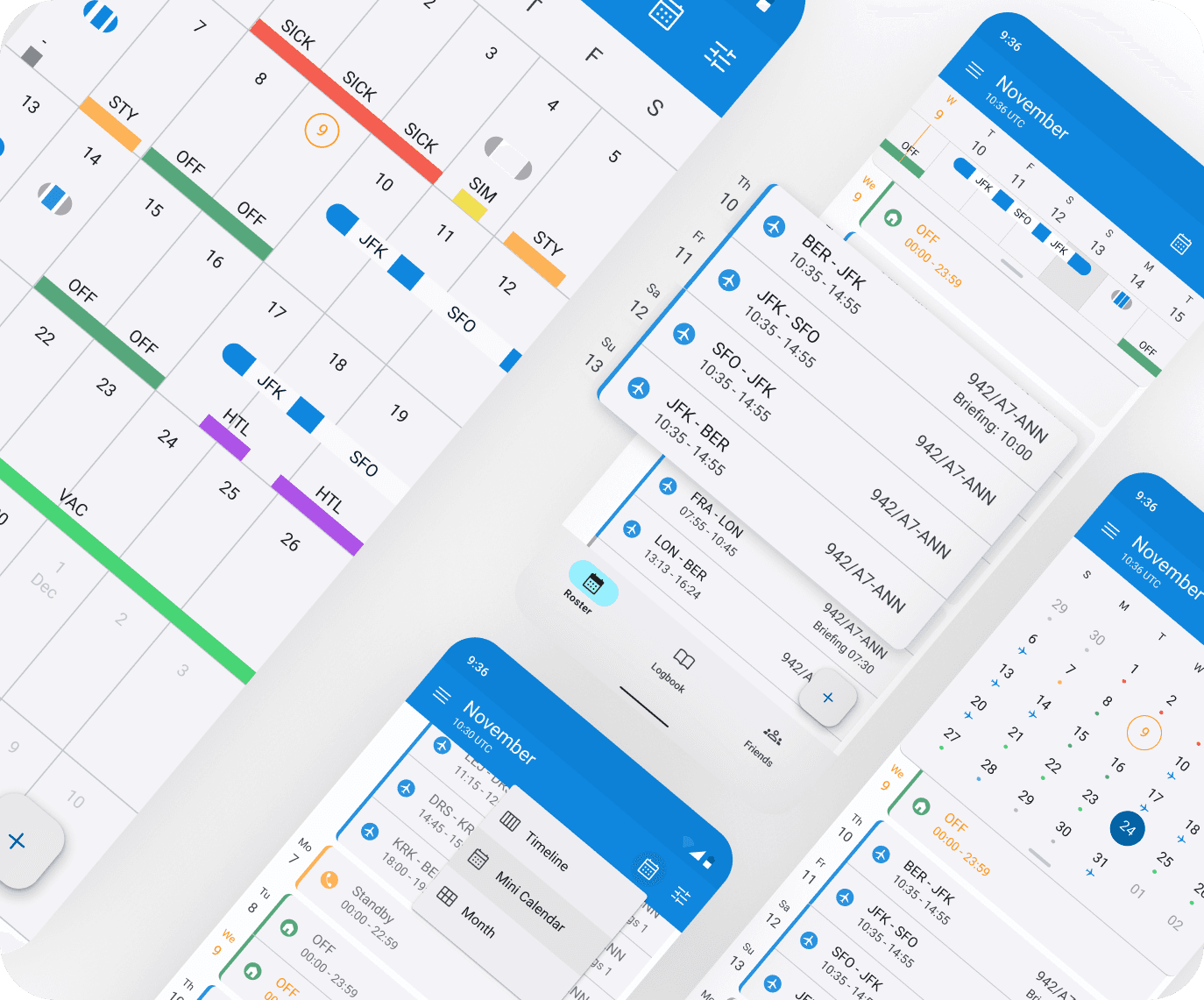
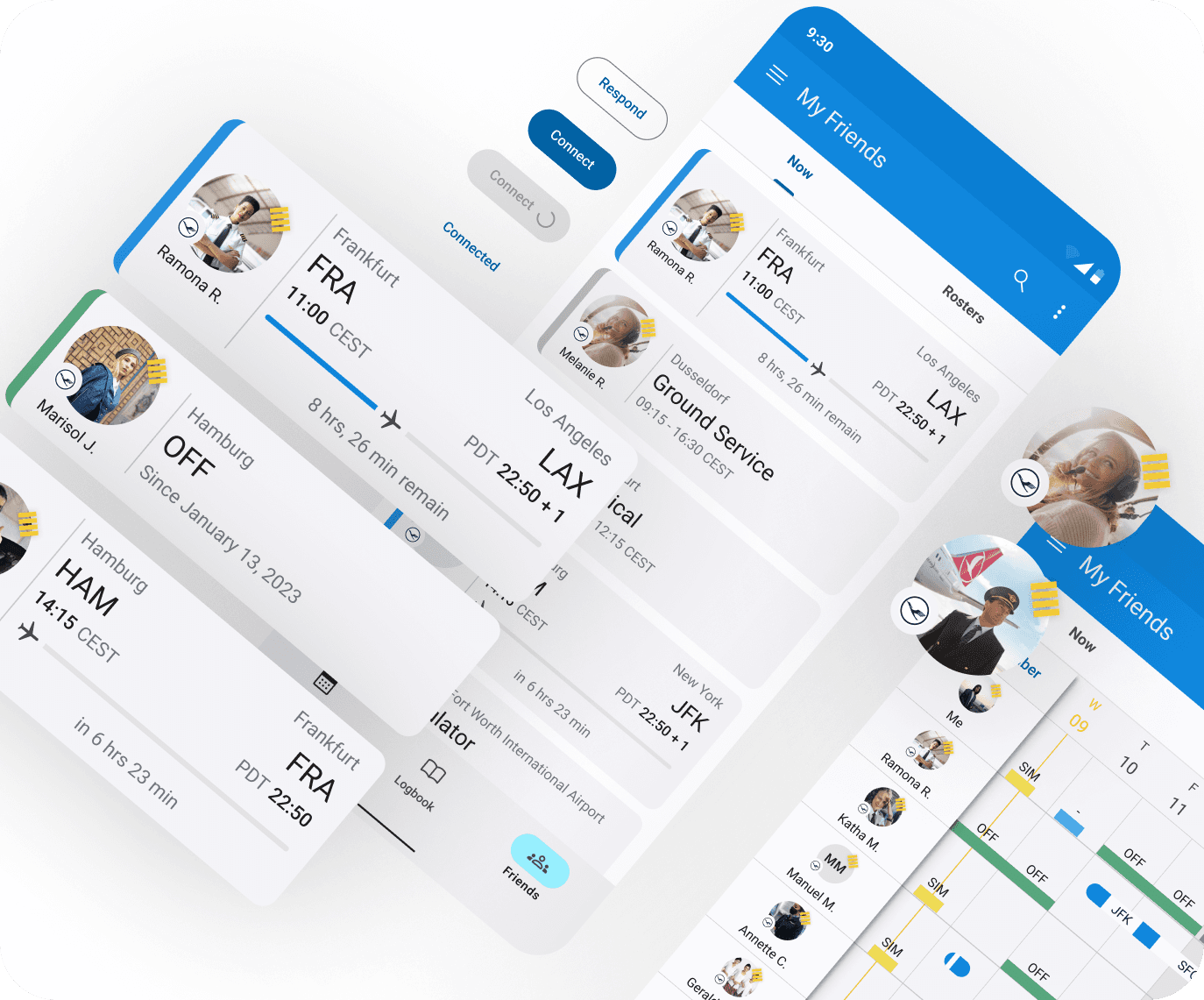
Elevate the UI: We took feedback from our iOS users and introduced new elements such as a calendar view, timeline, friends section, etc.
Design Tools
During my time at Offblock, I used
Figma to Design wireframes, mockups and prototypes.
FigJam to brainstorm with team members, create user flows, sitemap and keep visual research.
Notion helped me keep a well documented process, user research, important information about the app and more.
Phrase was the tool we used to translate the app into different languages, with the plugin the connected it to Figma, it was a smooth process.
Google Analytics helped us understand key usability issues in different user flows, to improve them.
These tools helped me to have a smooth design process while also using the following design methods: User Research, User Interviews, User Journey Mapping, User Stories, Competitive Analysis, Visual Research, Prototyping and Testing.


Figure 4: Gif both iOS & Android main user flow
Figure 4: Gif both iOS & Android main user flow




Key Results
During the course of two years, we had a lot of good results and improvements, but the main ones, that would make this project successful are these:
Broader Audience: The iOS app was well establish and was successfully running for years, bringing the app to Android users, was meant doubling our user base and connectivity between users from both platforms.
Enhanced User Flows : We listen to our already existing users and improve many of the user flows for a more user friendly experience.
Boosted Subscriptions: The sales performance increased.
Improve Market Position: Closed the gap with our competitors, and open the door to new deals.
Conclusion
In summary, the OffBlock Android project has been about improving user experience and fostering connections among users, specially to bring that connectivity for Android users. By following Material Design principles, tailoring features for Android users, and integrating seamless communication tools.
This project has made me have a strong knowledge of not only the Android design patterns but also iOS.
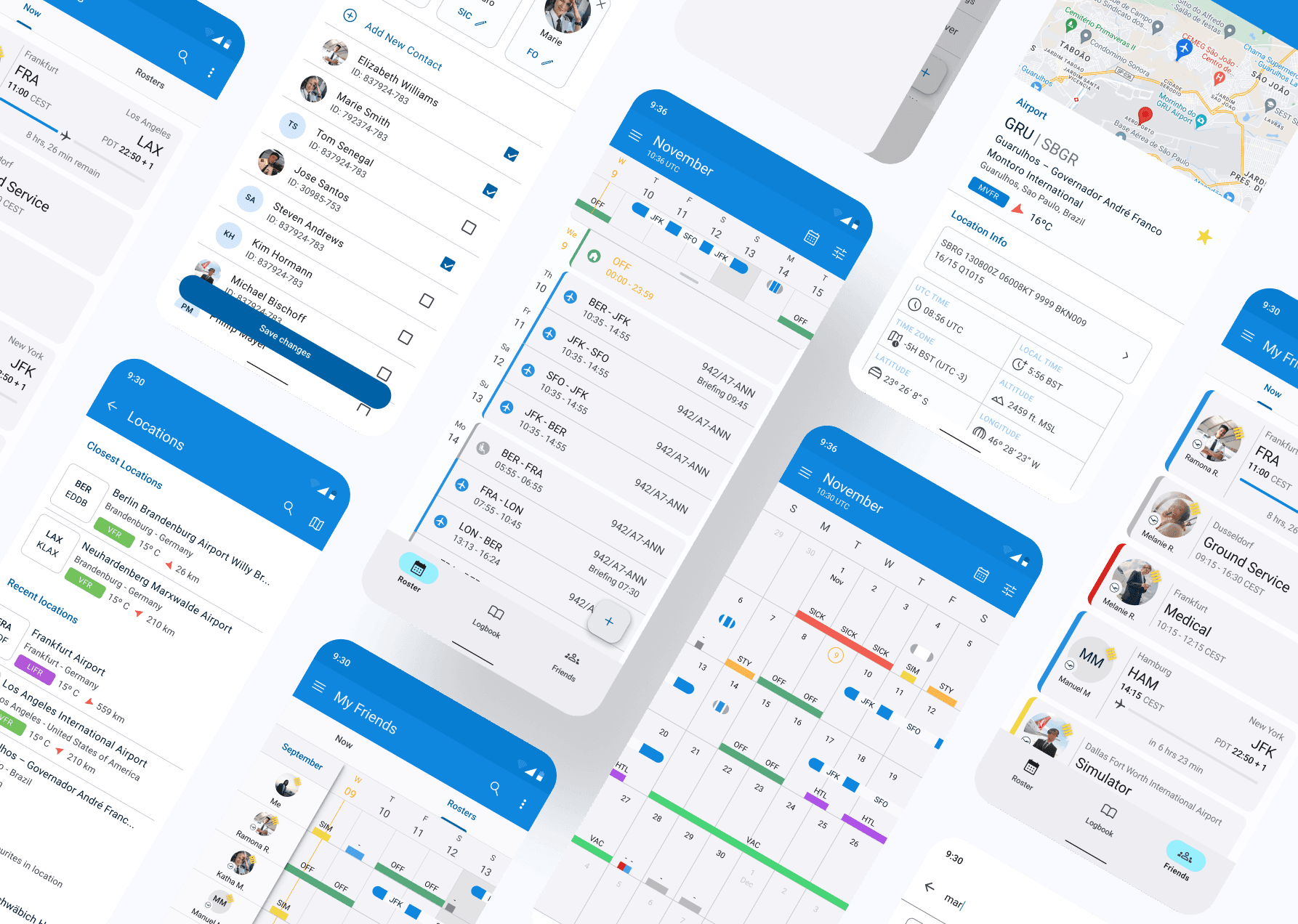


Figure 7: Android screens
Figure 7: Android screens
Credit
Mario Dujić - Android Developer
Thomas Cirksena - Android Developer
Igor Rešetić - Android Developer
Michael Ertel - Scrum Master
Janina Hopfgartner - iOS UI/UX Designer
Mario Dujić - Android Developer
Thomas Cirksena - Android Developer
Igor Rešetić - Android Developer
Michael Ertel - Scrum Master
Janina Hopfgartner - iOS UI/UX Designer
Barbara is now available for hire
Have a cool idea?
Let's make something cool together
Barbara is now available for hire
Have a cool idea?
Let's make something cool together
Barbara is now available for hire
