Social App
Moment
As the sole Product Designer, I assumed the responsibility of breathing life into the app and deciphering the users' needs.
Reading time:
3 minutes


Role
Role
Sole Product Designer
Contributions
Contributions
Product Design, Maketing, Social Media
Timeline
Timeline
Nov 2020 - Nov 2021
Deliverable
Deliverable
Overview
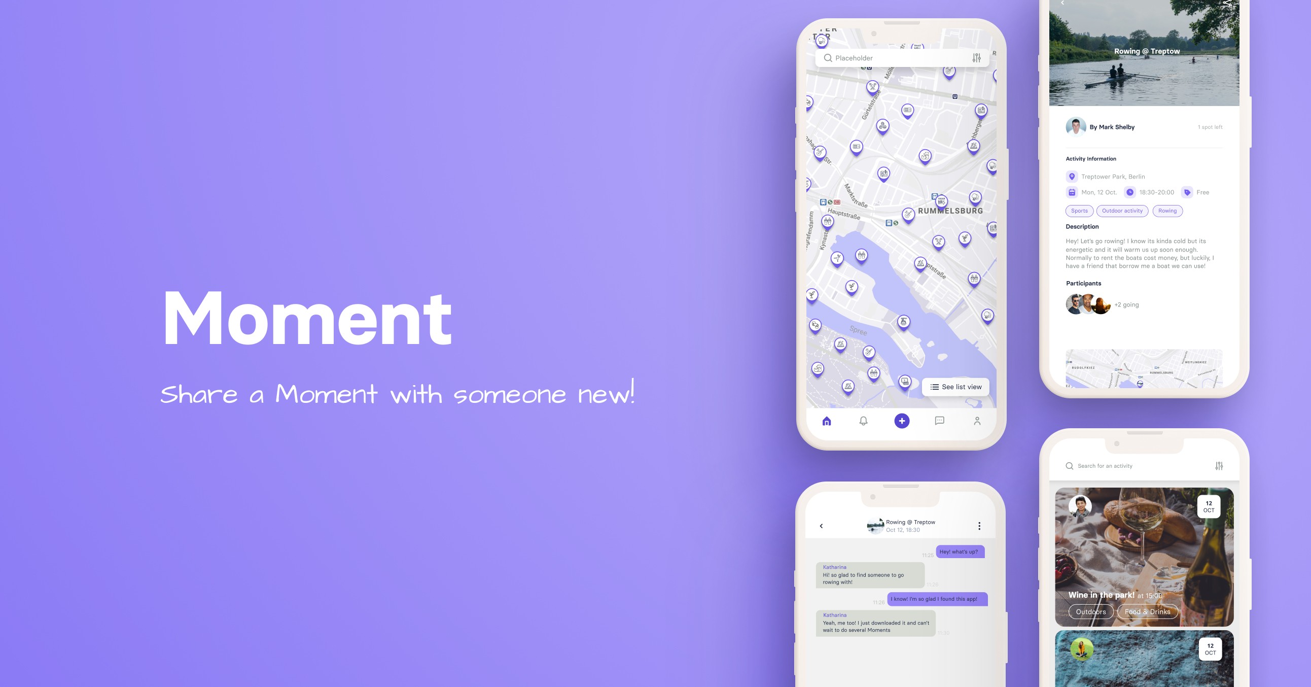
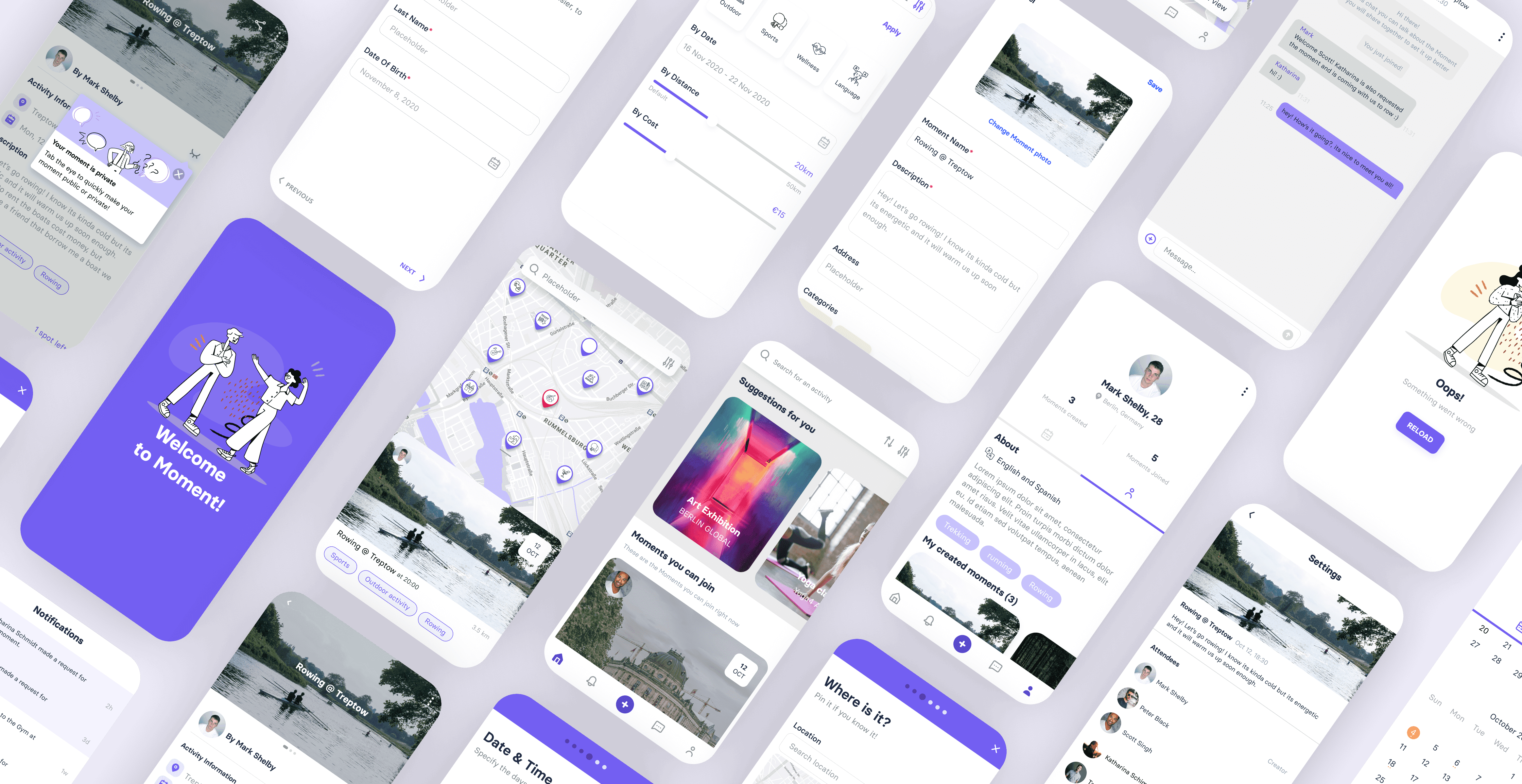
Moment is an app designed to simplify the process of connecting users with like-minded individuals for shared activities. With just a few clicks, you can effortlessly create an activity and choose who will join you.
As the sole Product Designer, I assumed the responsibility of breathing life into the app and deciphering the users' needs. Throughout a year-long journey, I engaged in extensive research, conducted user interviews, and developed both wireframes and high-fidelity prototypes. These methods allowed me to iterate with users, refining the user flow to enhance overall usability.
Challenge
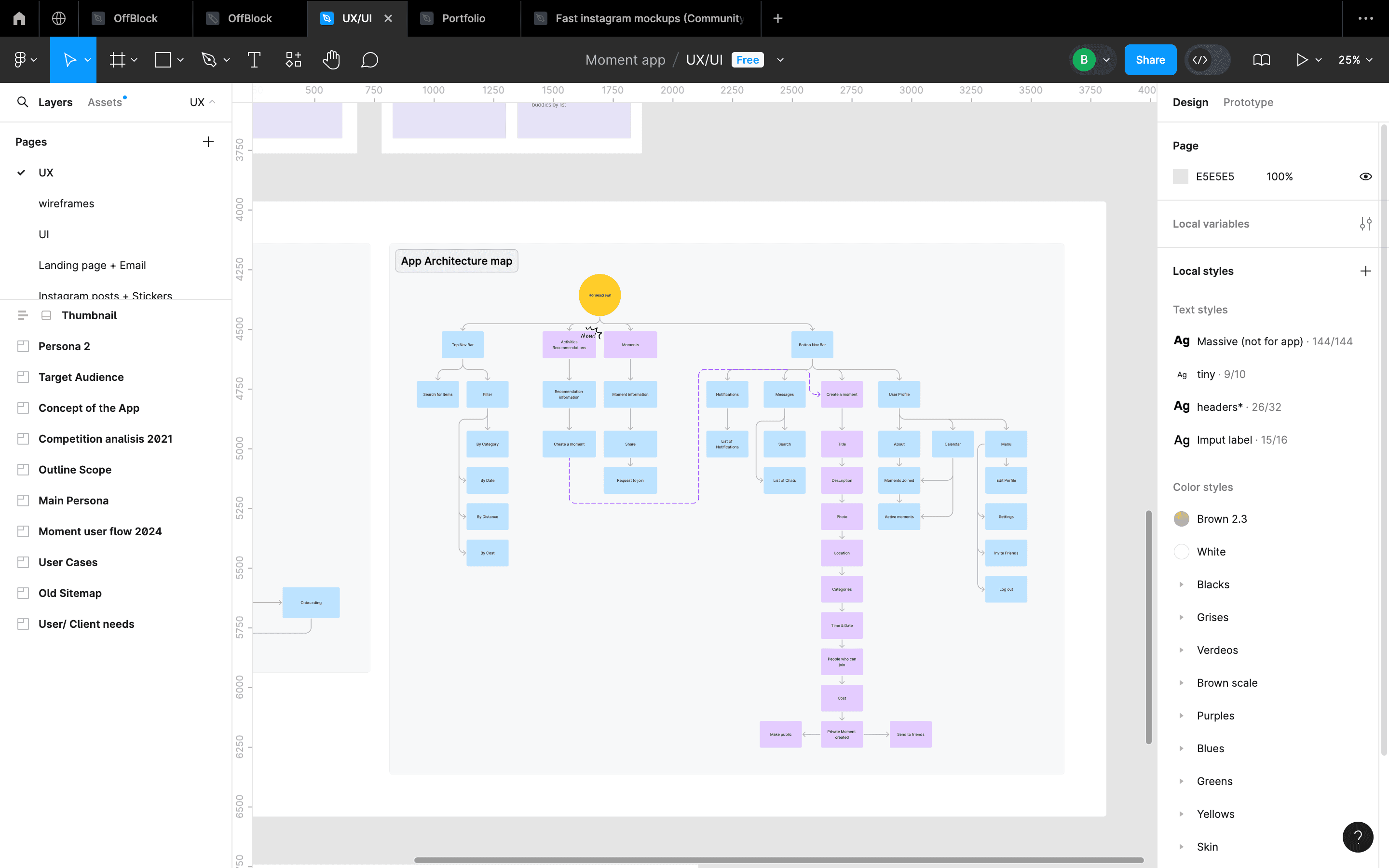
Before Moment came to life, we encountered a significant UX challenge: “How do we connect like-minded individuals so that they can share activities together?” To address this, we delved into extensive user research to comprehend and create user personas. Additionally, we meticulously crafted a comprehensive architecture map for the app, aiming for seamless usability. The journey involved solving the puzzle of user needs, and the end goal was to provide an app that is both intuitive and user-friendly.
Before Moment came to life, we encountered a significant UX challenge: “How do we connect like-minded individuals so that they can share activities together?” To address this, we delved into extensive user research to comprehend and create user personas. Additionally, we meticulously crafted a comprehensive architecture map for the app, aiming for seamless usability. The journey involved solving the puzzle of user needs, and the end goal was to provide an app that is both intuitive and user-friendly.




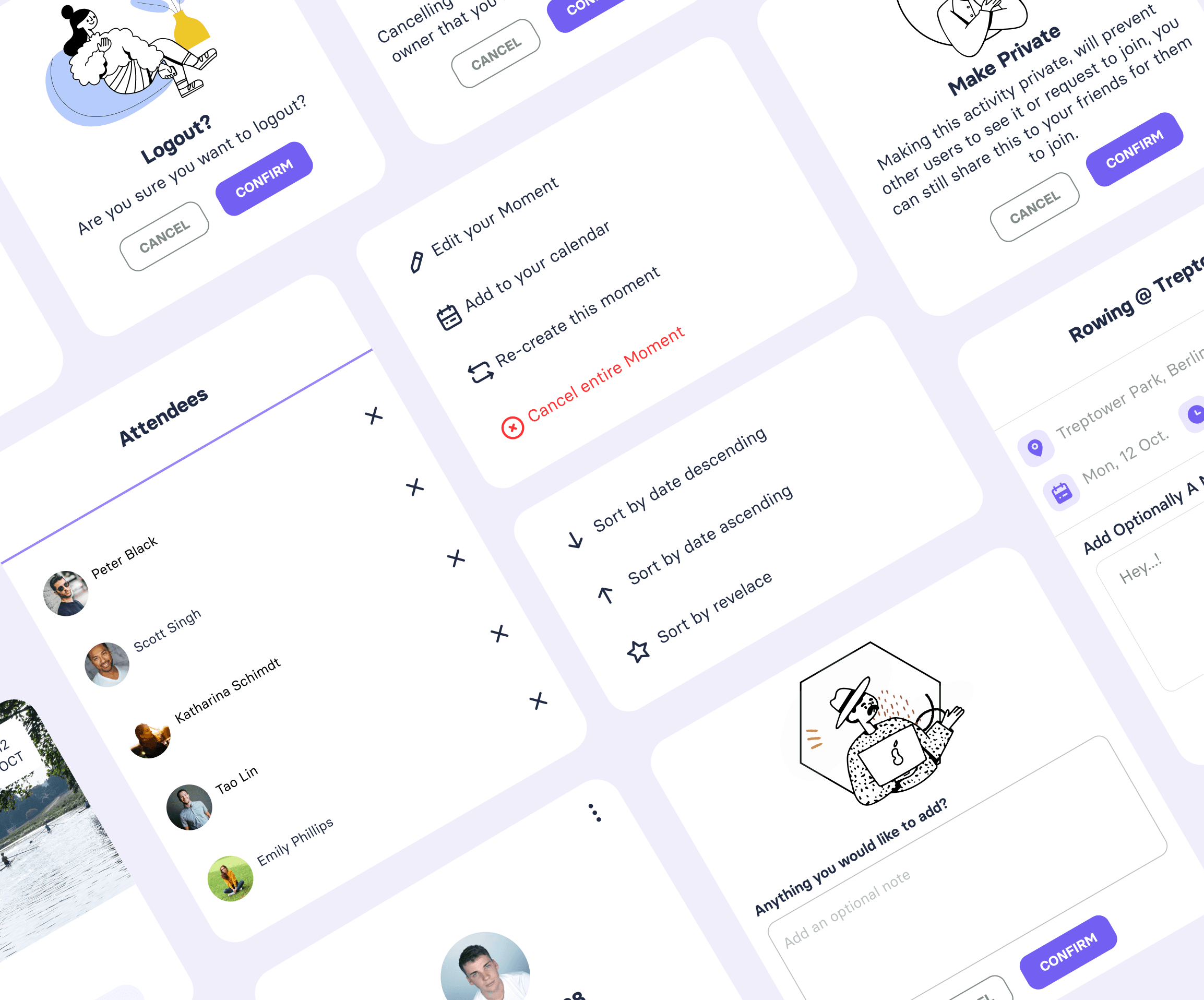


Design Process
I meticulously crafted prototypes to align with project goals and established a vibrant social media community for meaningful interactions and feedback. My process was as follows:
Set Design Goals: We aimed for accessibility, strong brand identity, simplified user flows, and clarity.
User Research: I conducted extensive research through hands-on observations and interactions with target users over three months, using low-fidelity wireframes to shape our primary user flow.
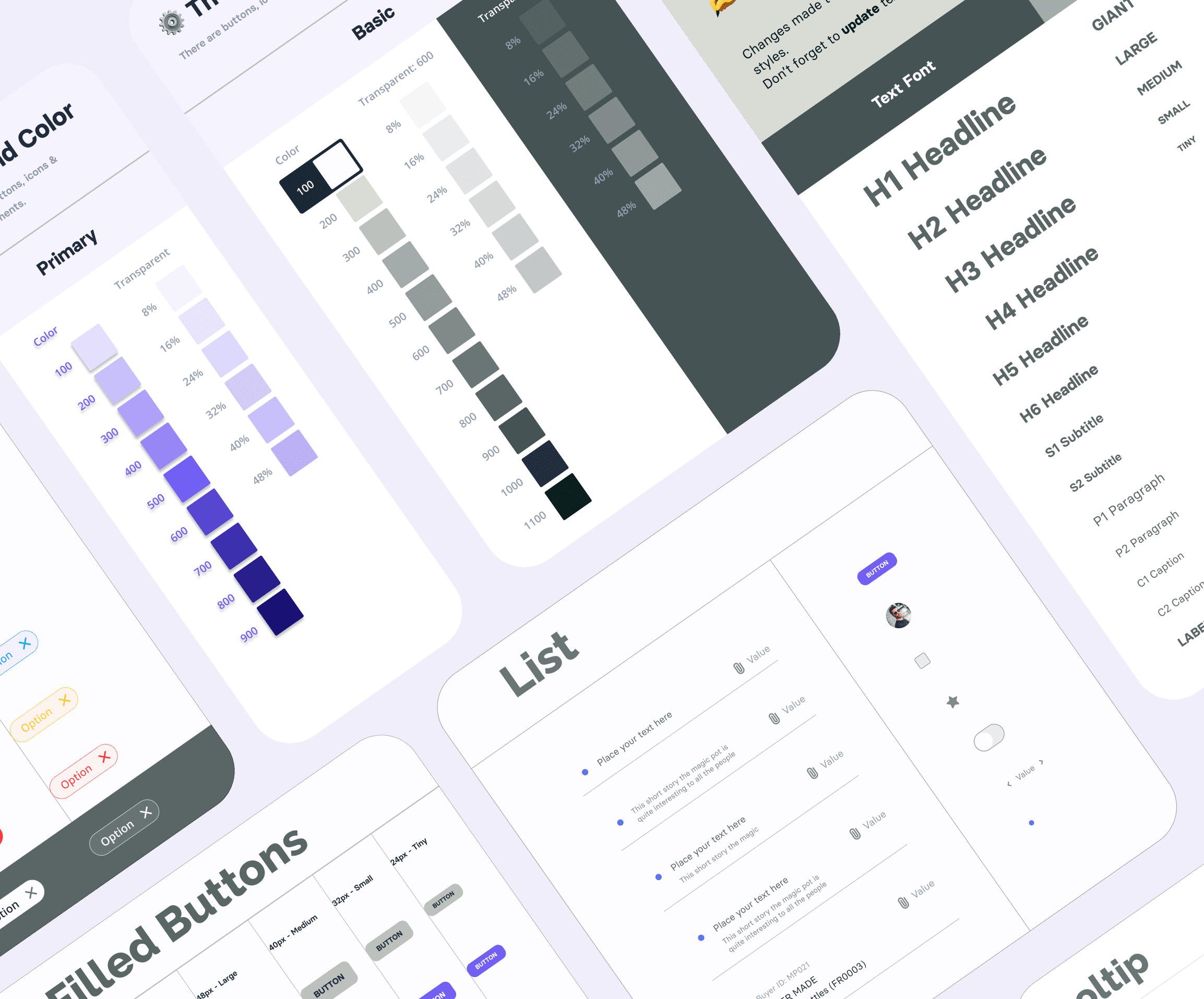
Design & Prototyping: Using the Eva Design System, I created base components following 'atomic design' principles, ensuring seamless modifications and consistency across the app.
Usability Testing: I developed low-fidelity designs and wireframes to test with users, identifying pain points and potential conflicts to refine the user experience.
Iteration and Release: Post-release, we continuously listened to users to improve flows and add beneficial features.
Design Goals
We set from the beginning design goals that would guide us through the design process but also bring the best app possible to our users.
User-Centric Design: Prioritise understanding and addressing the needs and preferences of the target users. Conduct thorough user research, create user personas, and design the app interface and features to enhance the overall user experience.
Scalable and Sustainable Architecture: Develop a robust and scalable architecture that can accommodate future growth and changes. Plan for scalability, security, and maintainability to ensure the app can evolve and adapt to the increasing demands and advancements in technology over time.
Iterative Design: We tested and tested every step of the way, with that, insuring that we would go back into the designs to change usability issues and pain points the users would encounter in the way.
Design Tools
These are the tools that helped me create user-centric designs for moment:
Figma was were I created everything related to the designs, wireframes, mockups, prototypes, etc.
Notion helped me to keep all the user research I conducted
Wix to create and host our website
These are the tools that helped me create user-centric designs for moment:
Figma was were I created everything related to the designs, wireframes, mockups, prototypes, etc.
Notion helped me to keep all the user research I conducted
Wix to create and host our website
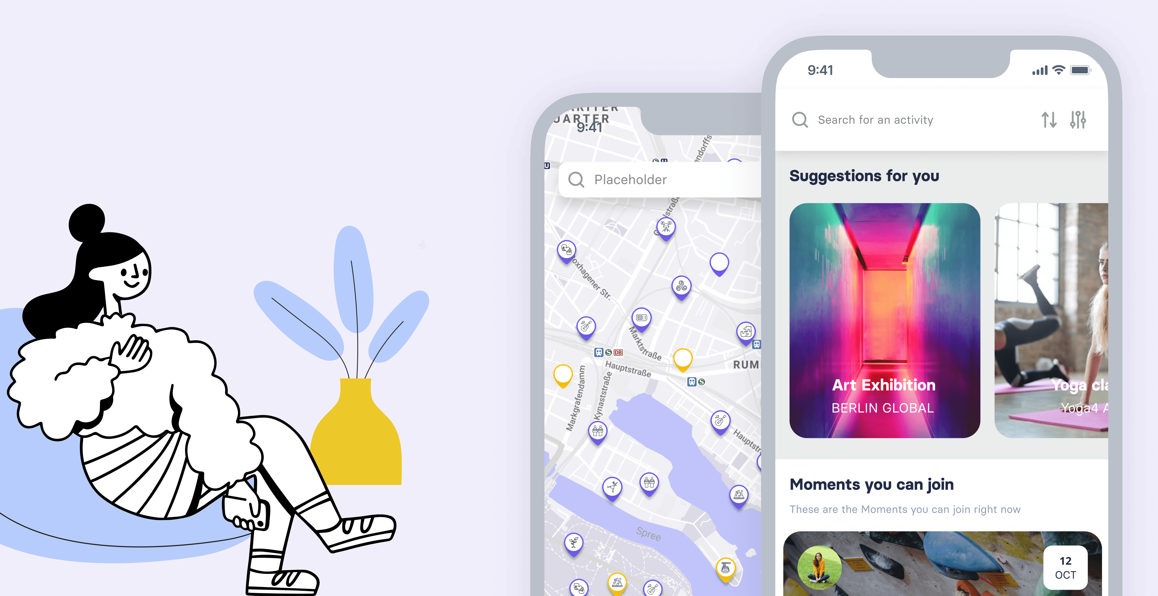


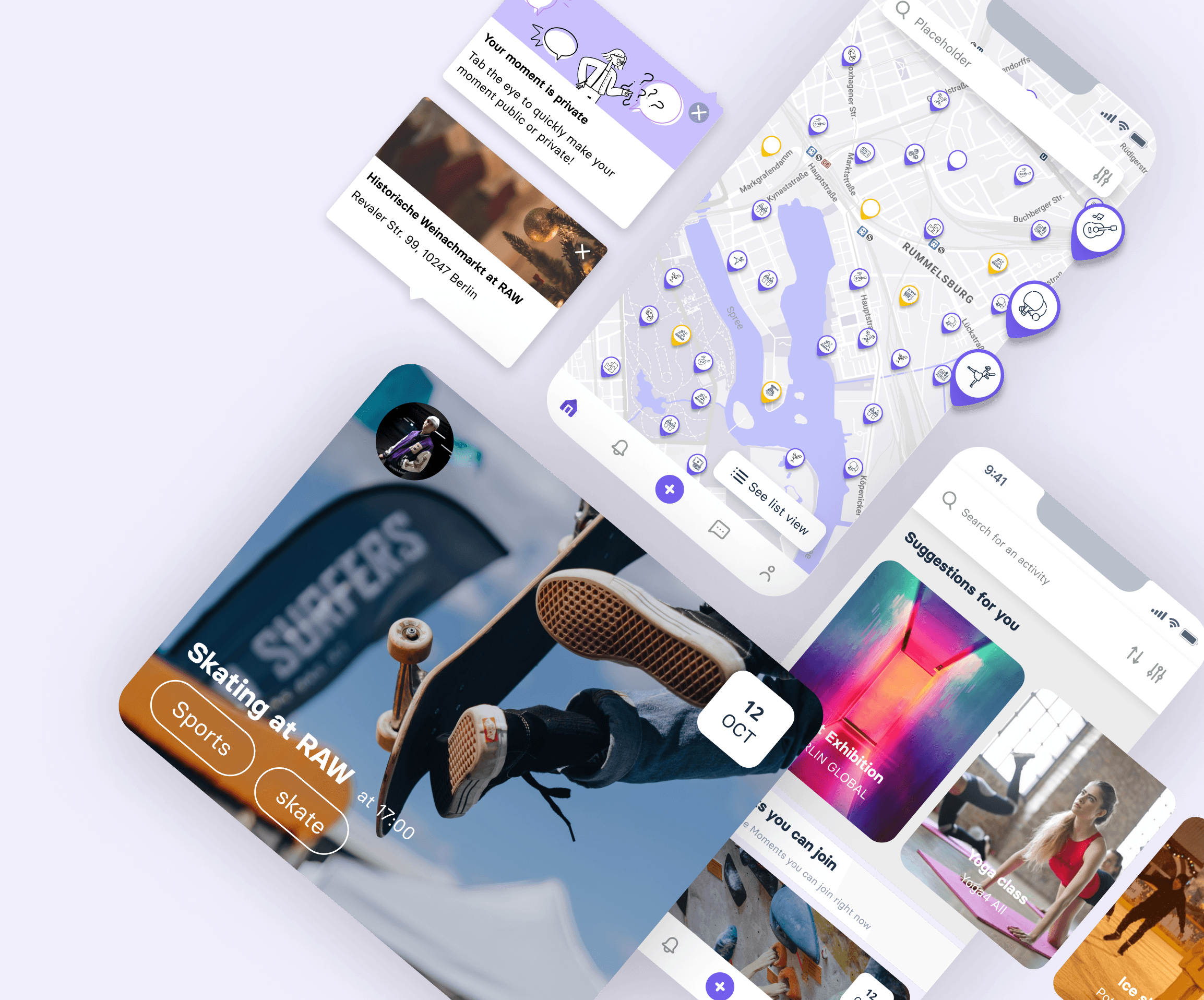


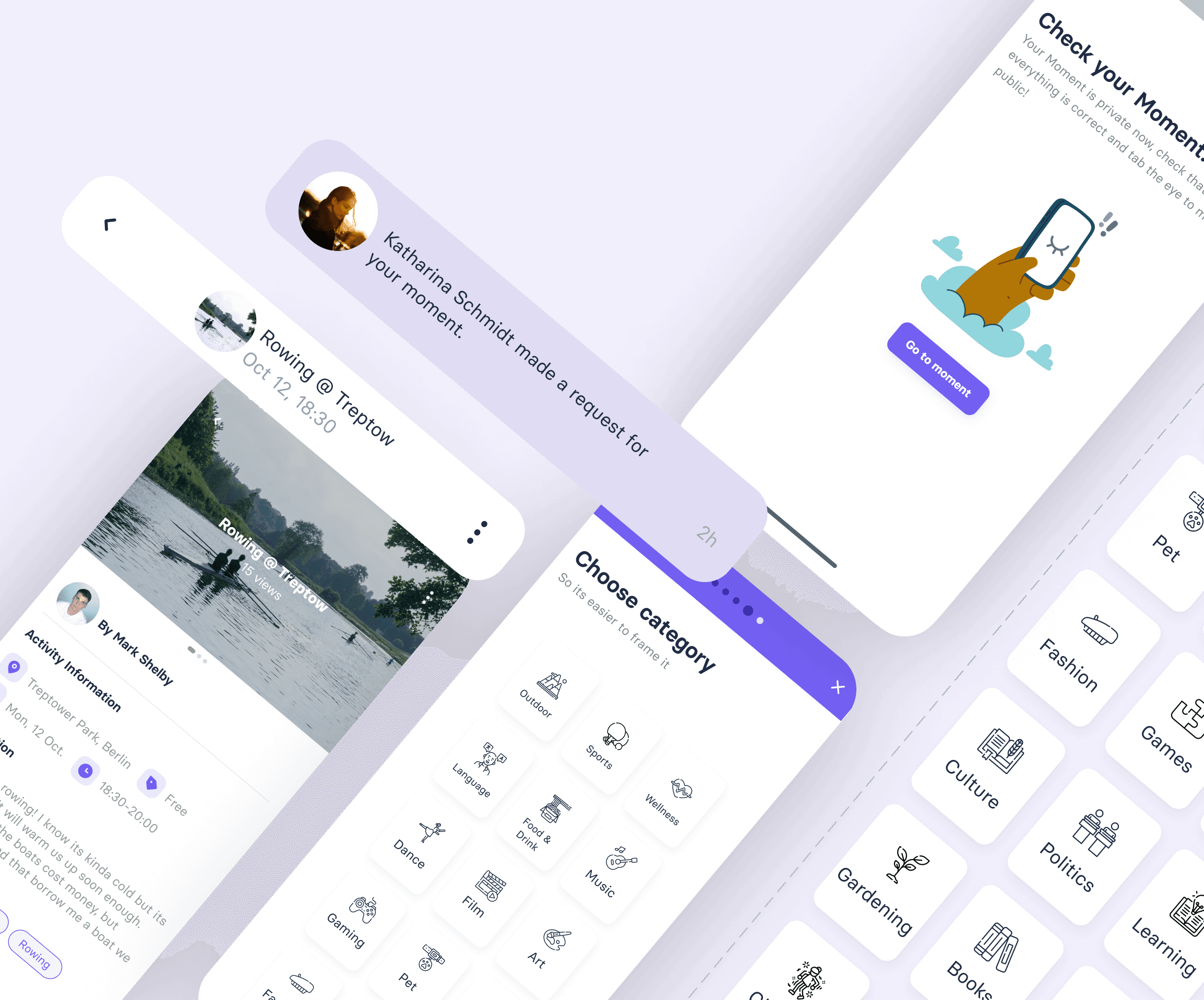


Key Results
The creation of Moment had various results that we considered a success. During the first months we had 800 downloads with very little investment. Thanks to our constant user research, we improve the following user flows:
The Moment creation was smooth and with simple steps, reducing the time the users needed to created by 20% on the second iteration.
We had 800 downloads with minimum investment on the first months.
Conclusion
In summary, the development of the Moment app was driven by a user-centric approach, incorporating extensive feedback to refine key features. The design process focused on enhancing user experience, from providing multiple data visualization options to streamlining the creation process into a simple 6-step procedure. The utilization of atomic design principles and variant components further demonstrated a commitment to efficiency and consistency.
Overall, the iterative nature of the design process, guided by user insights, ensured the app's functionality was not only intuitive but also adaptable to users' preferences and needs.


Credits
Dylan Clarke - Lead Developer
Nahuel Balmaceda - Graphic Designer
Dylan Clarke - Lead Developer
Nahuel Balmaceda - Graphic Designer
Barbara is now available for hire
Have a cool idea?
Let's make something cool together
Barbara is now available for hire
Have a cool idea?
Let's make something cool together
Barbara is now available for hire
